Testbirds is a world-leading crowdtesting provider, that empowers clients to elevate their digital products through real user insights.
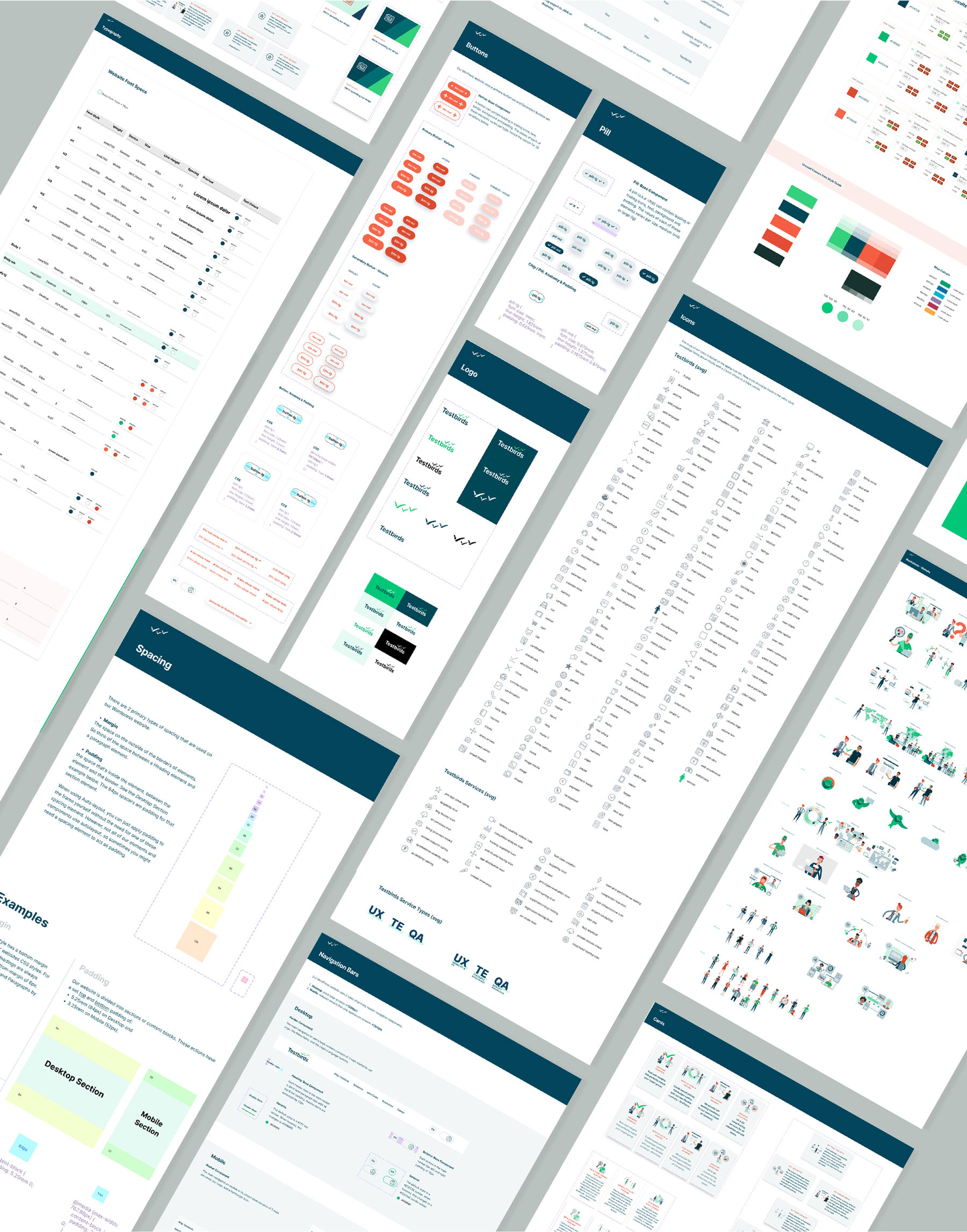
As part of the rebranding process, the website underwent a complete redesign. This included creating and continuously refining a cohesive design system. My role focused on curating, developing, and iteratively enhancing key design elements to optimize the user experience.
View the Testbirds Website
As part of the rebranding process, the website underwent a complete redesign. This included creating and continuously refining a cohesive design system. My role focused on curating, developing, and iteratively enhancing key design elements to optimize the user experience.
View the Testbirds Website
Customer Journey and Contact Form Improvements
This project involved optimizing the customer journey and enhancing the contact form—one of several processes I worked on to improve overall user flow and engagement. These improvements aimed to reduce friction, increase conversions, and provide users with a more intuitive experience.
Defining the problem
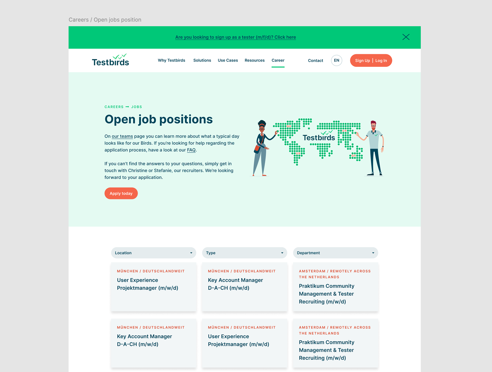
On the Testbirds website, approximately 95% of the traffic comes from aspiring testers looking to access the so-called Nest platform and register.
This user group needs clear guidance to reach their registration goal, with the aim for a higher success rate (sign in), reduced time on task, and lower error rates.
This user group needs clear guidance to reach their registration goal, with the aim for a higher success rate (sign in), reduced time on task, and lower error rates.
The remaining 5% of the traffic consists of potential clients seeking information about Testbirds' services. The primary goal with these users is to connect them with the Sales and Project Management team, aiming for an increased conversion rate.
After receiving feedback from the Sales department that some aspiring testers were still reaching out directly instead of registering on the Nest platform, we decided to make substantial modifications.
After receiving feedback from the Sales department that some aspiring testers were still reaching out directly instead of registering on the Nest platform, we decided to make substantial modifications.
Research and Testing
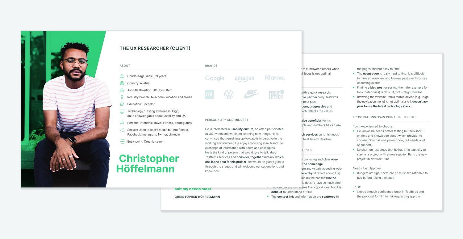
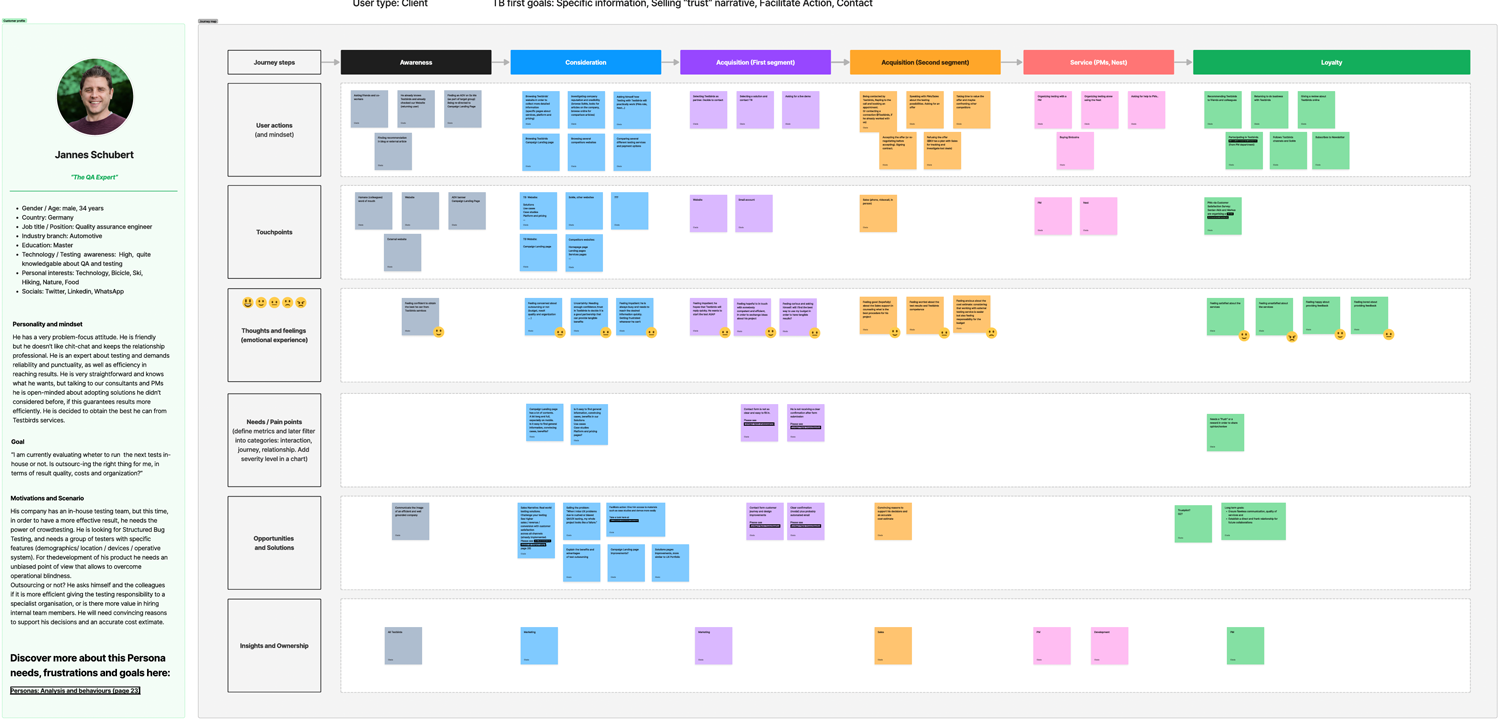
I prioritized understanding user pain points by conducting thorough customer journey mapping alongside the personas we developed, with the support of different departments.
There were 7 different Personas: 4 Clients, 1 aspiring Tester, 1 Partner and 1 potential Employee.
Additionally, I performed competitive research to analyze how similar challenges were addressed in the industry.
There were 7 different Personas: 4 Clients, 1 aspiring Tester, 1 Partner and 1 potential Employee.
Additionally, I performed competitive research to analyze how similar challenges were addressed in the industry.
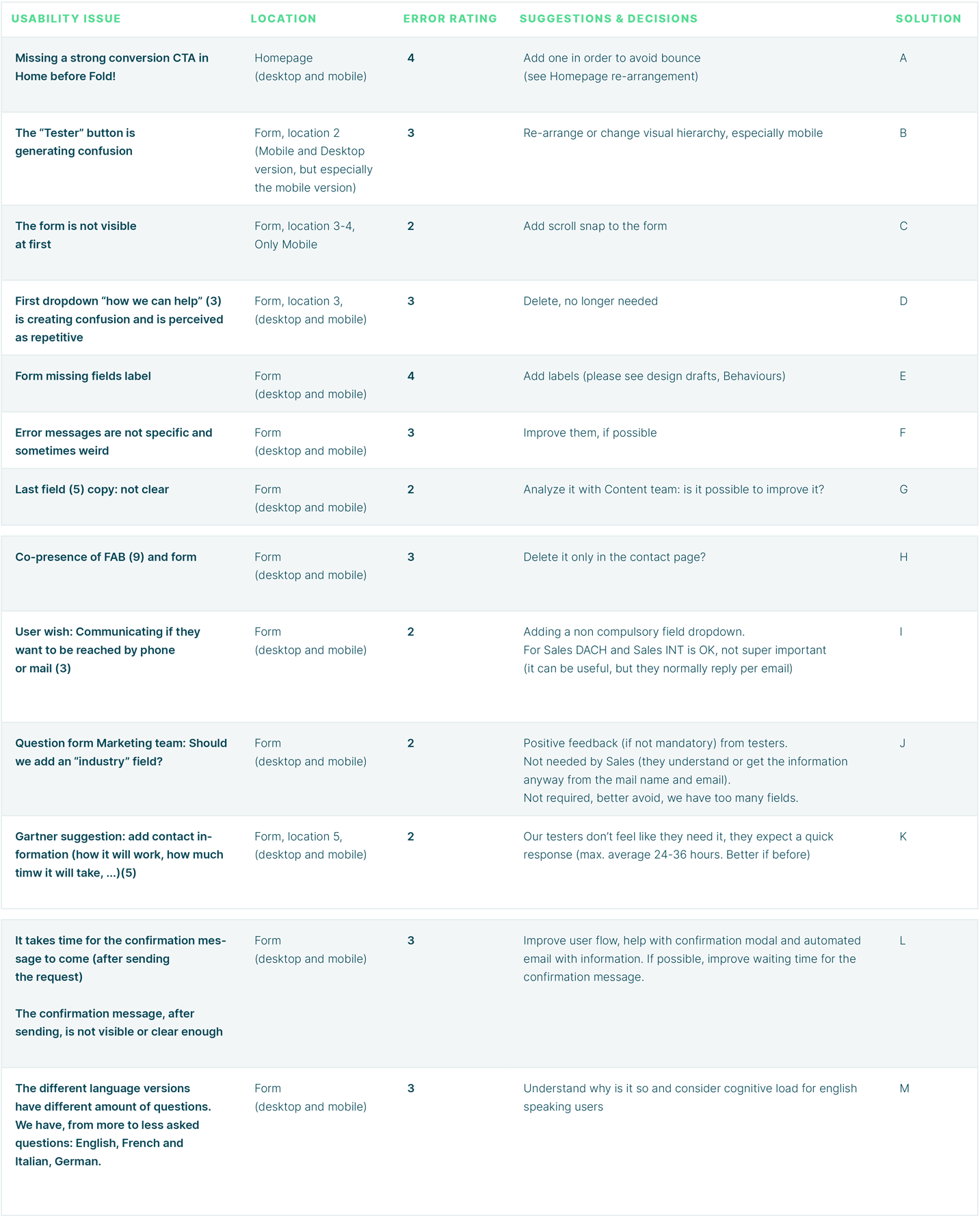
To identify website improvements, I conducted research by reviewing analytics, observing user recordings, and analyzing other tools like heatmaps and scrollmaps through Hotjar.
These insights revealed user interaction patterns and provided valuable information on how users navigated the site, where they encountered obstacles, and which elements engaged them most effectively.
The next step involved a remote usability test with individuals representing the client’s and tester's target audience. The goal of this testing phase was to assess the usability of the forms and identify potential areas for improvement. Internal feedback also played a key role as a valuable tool in refining the design.

Improvements
Following comprehensive research and usability testing, the team decided on several key improvements:
• Enhanced Main Navigation: Improved the primary navigation with tooltips and clear button labels to support easier user orientation.
• Guidance Widget: Introduced a “widget” tool to offer on-page guidance and support, helping users navigate the site seamlessly.
• Bridge page: Added a bridge page as an intermediary step in the user flow. This page provides context, clarifies options, and reduces potential confusion by offering a structured path to key sections.
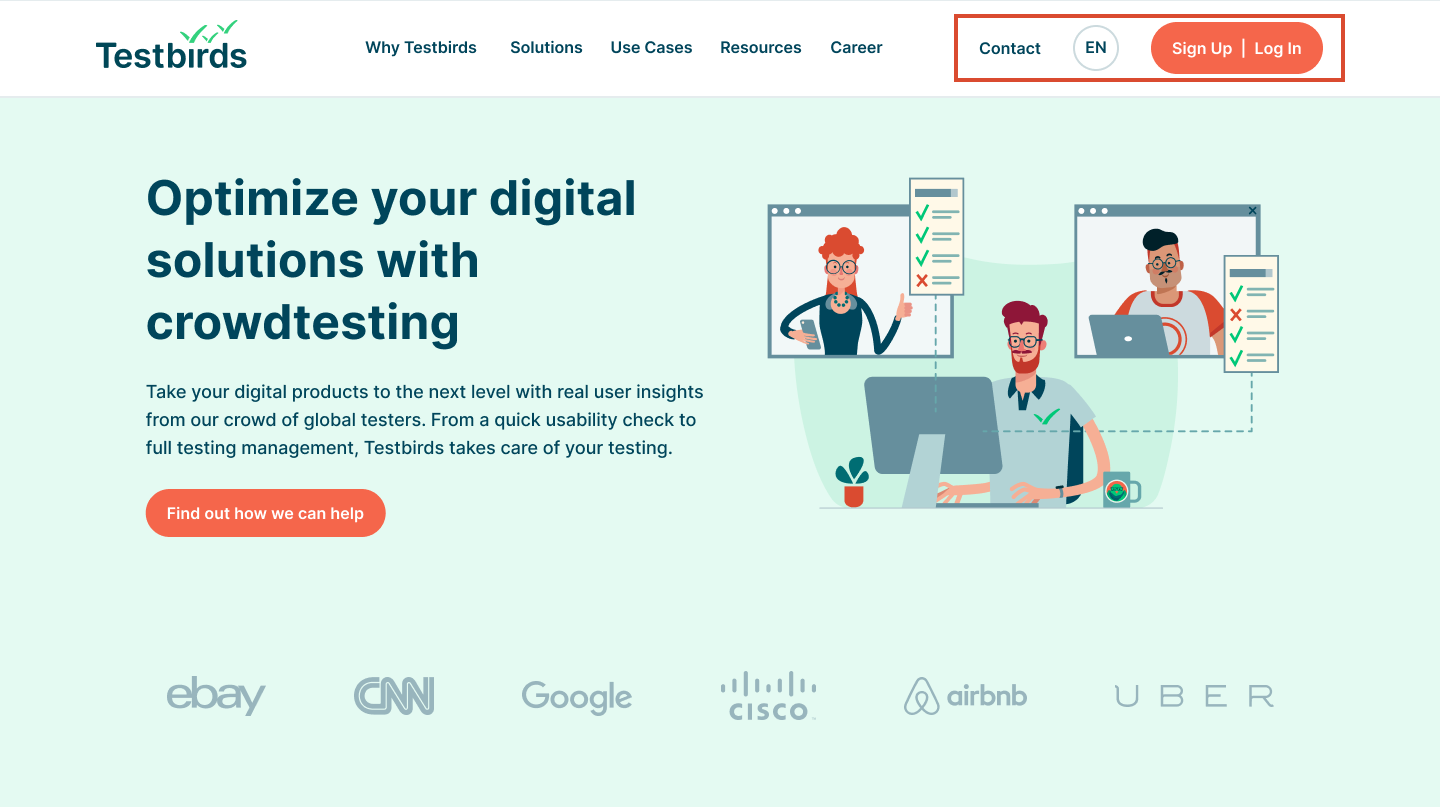
BEFORE:
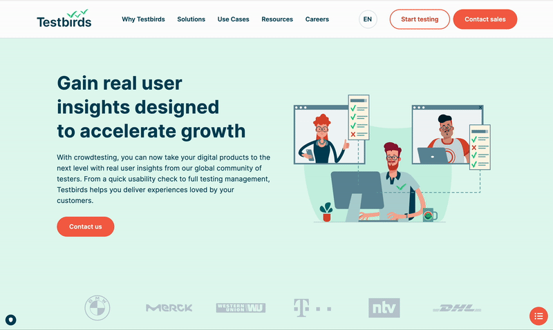
AFTER:
• Banners for Highlights: Added banners to draw user attention to priority content. These banners are strategically placed in high-visibility areas on pages with the highest tester traffic.
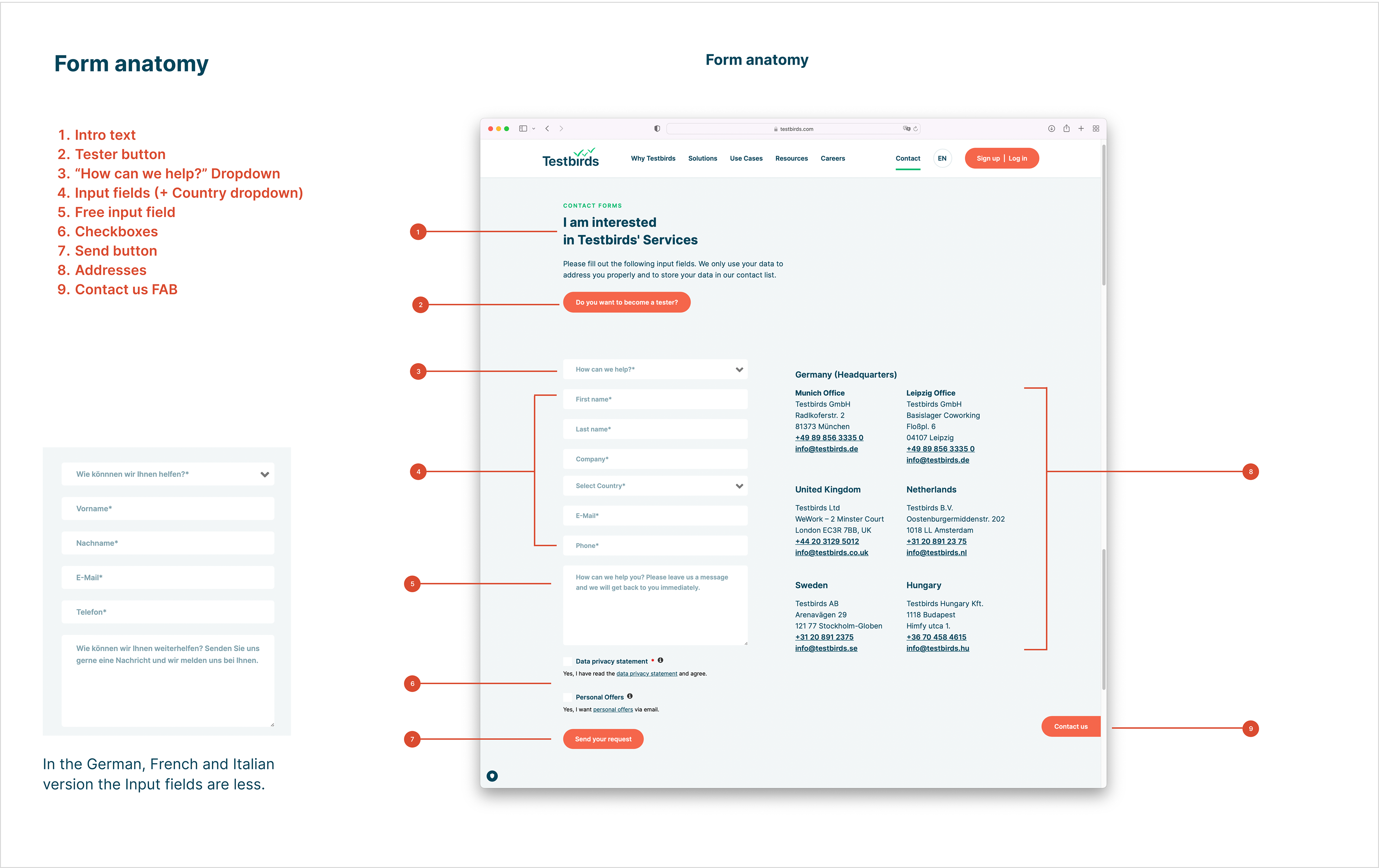
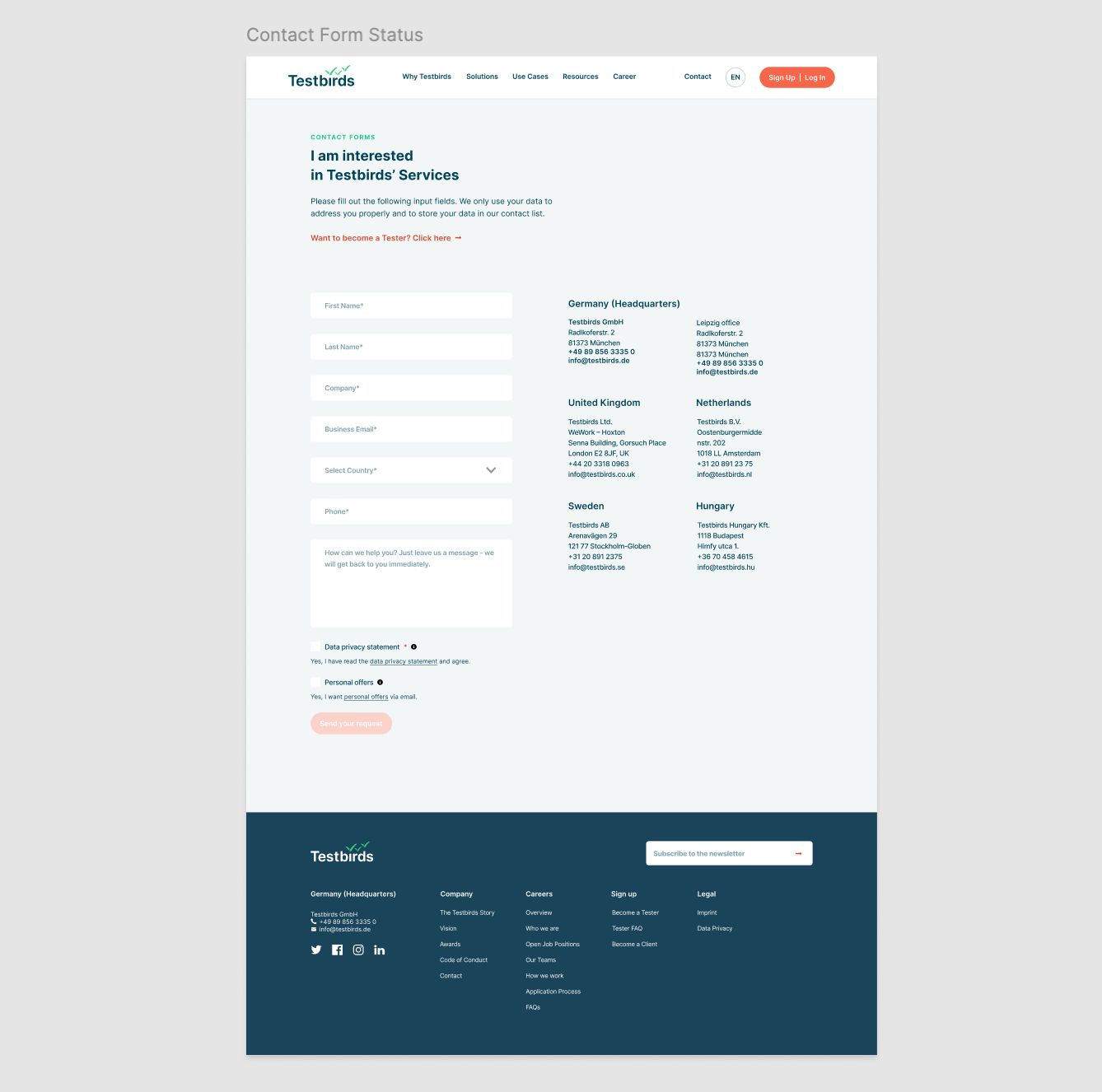
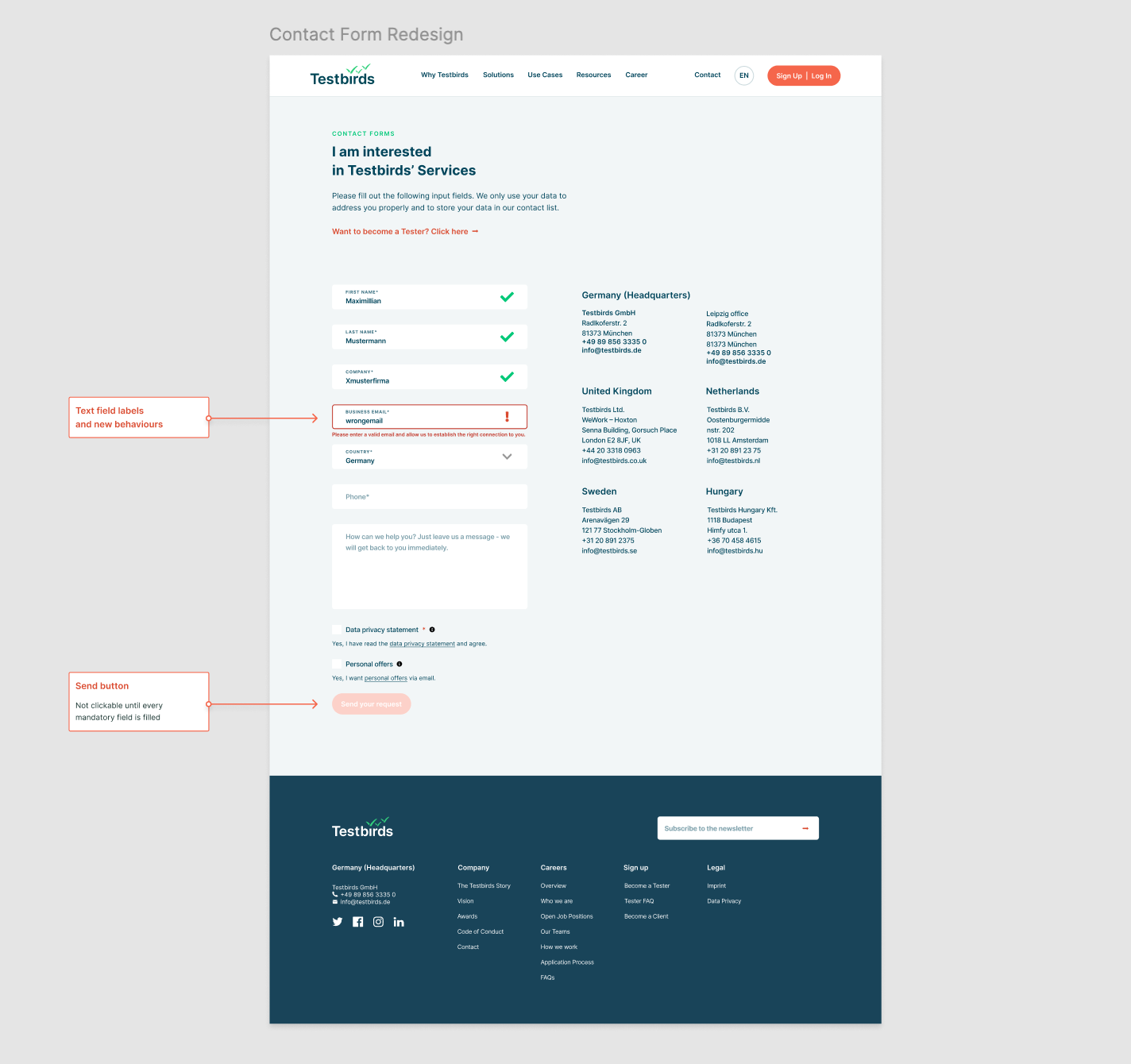
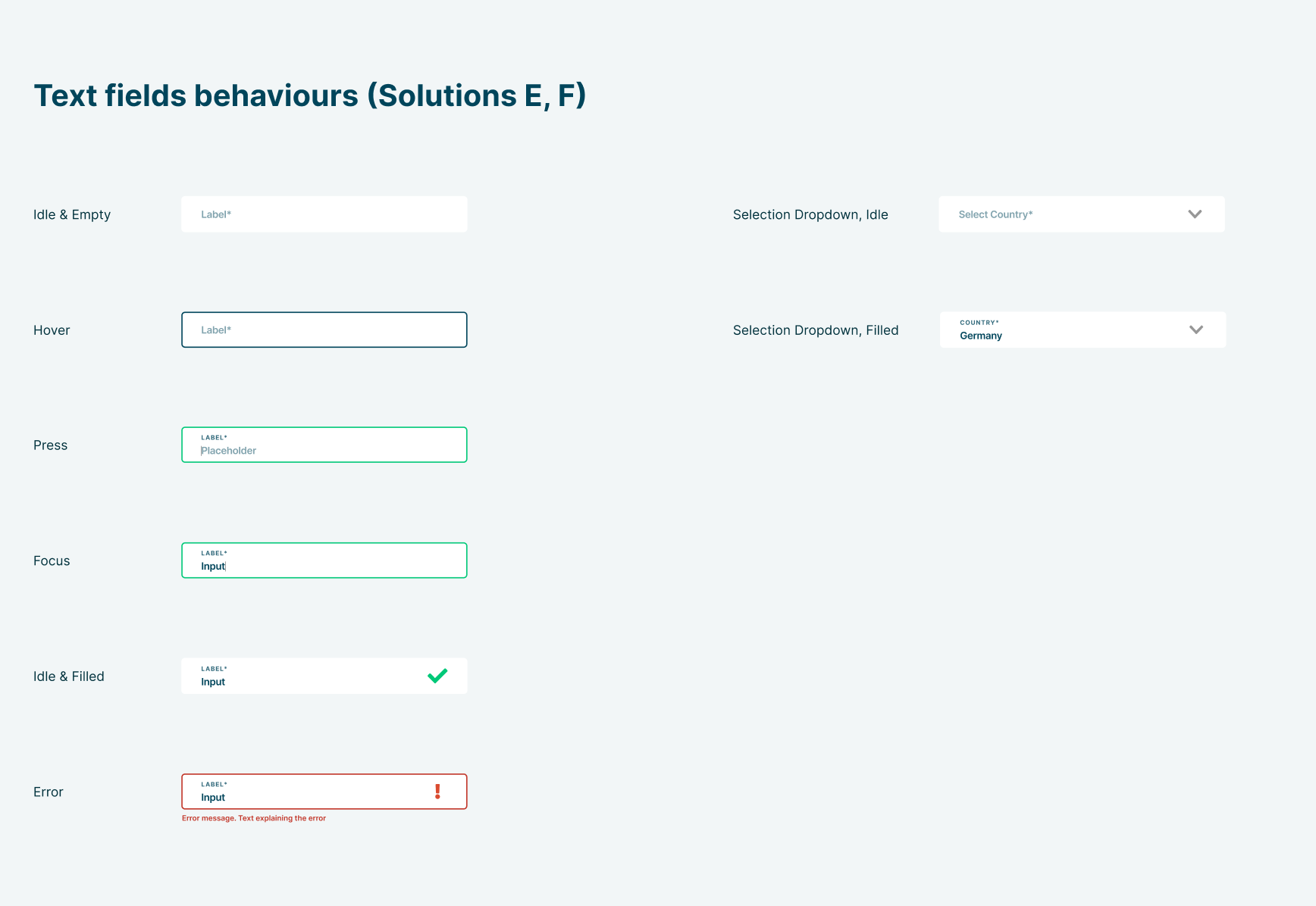
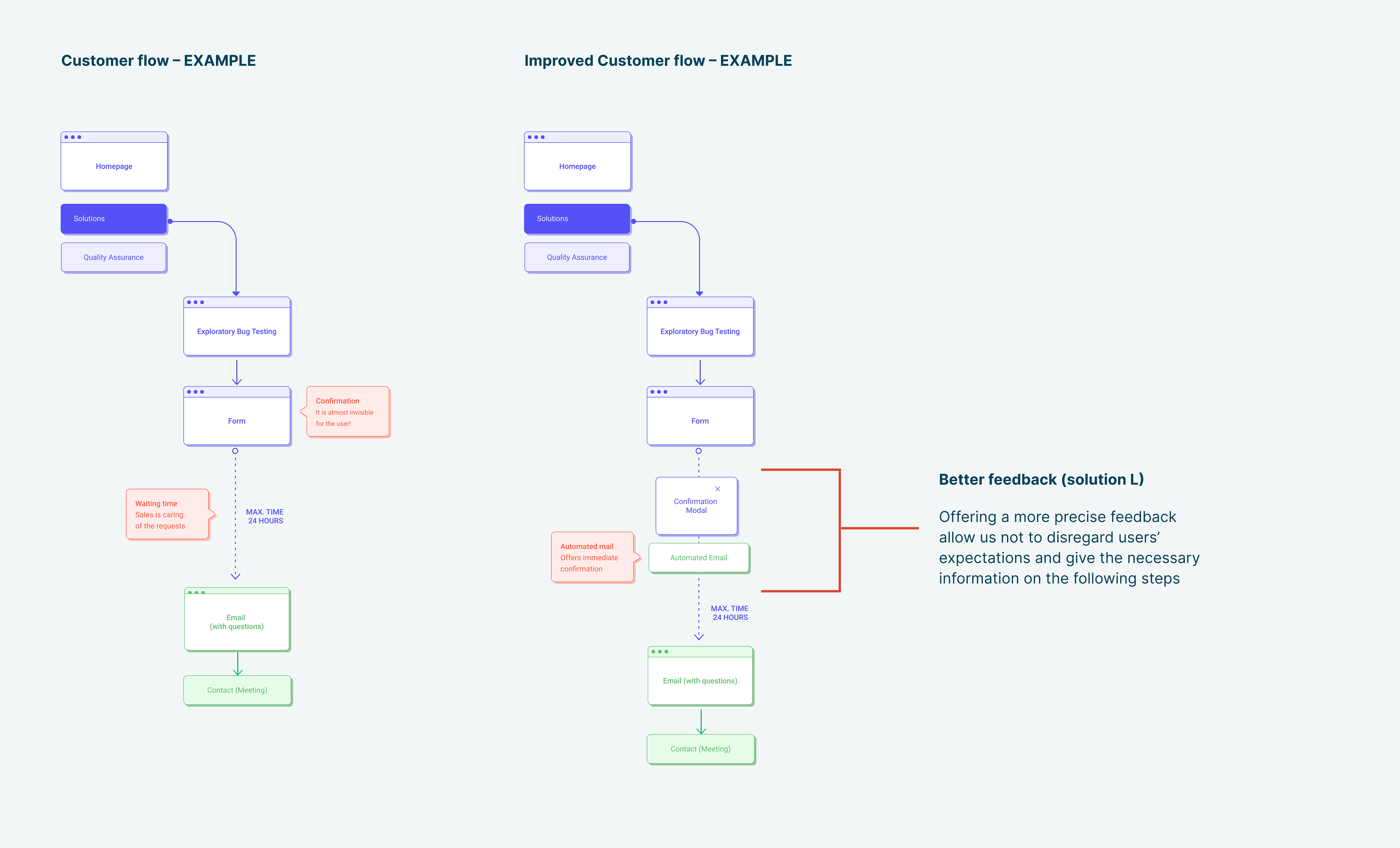
• Redesigned Contact Form: We created a more intuitive and user-friendly contact form, reducing friction by using field labels, implementing technical improvements, enhancing form behaviors and error messages. The overall user experience was also improved by optimizing the notification process users receive after submitting the form.
Next Steps
As a next step, we planned to transform the form into a multi-step process, to guide users more intuitively through each stage.
Additionally, there is the possibility to integrate an appointment booking feature that allows clients to schedule a live demo instantly, streamlining the path from inquiry to engagement and enhancing user convenience.
Curious about other projects I’ve worked on? Let’s chat!
Additionally, there is the possibility to integrate an appointment booking feature that allows clients to schedule a live demo instantly, streamlining the path from inquiry to engagement and enhancing user convenience.
Curious about other projects I’ve worked on? Let’s chat!